Policy Payment
Project context
Policy payment was one of the most frequently used features in Prudential's PRUServices app, allowing policyholders to pay their premiums online. The journey looked simple on the surface: select a policy, choose a payment method, and confirm. But the first step carried complex policy terms, payment rules, eligibility states, and amount-editing behaviour.
Problem
The live flow had already been used by customers, so the redesign could not change behaviour too aggressively. The main issue was clarity: customers had to select a policy while also understanding payment amount, due date, status, auto-deduction information, and editing options.
Business goal
Create a clearer payment baseline for PRUServices without disrupting the live version behaviour customers already knew.
My role
I reviewed the existing Malaysia flow, identified clarity issues in the policy selection step, and redesigned the experience across desktop and mobile. I worked closely with the product owner, BA, and developers to align business rules, interaction behaviour, and implementation details.
Why this matters
Payment was too critical to redesign casually
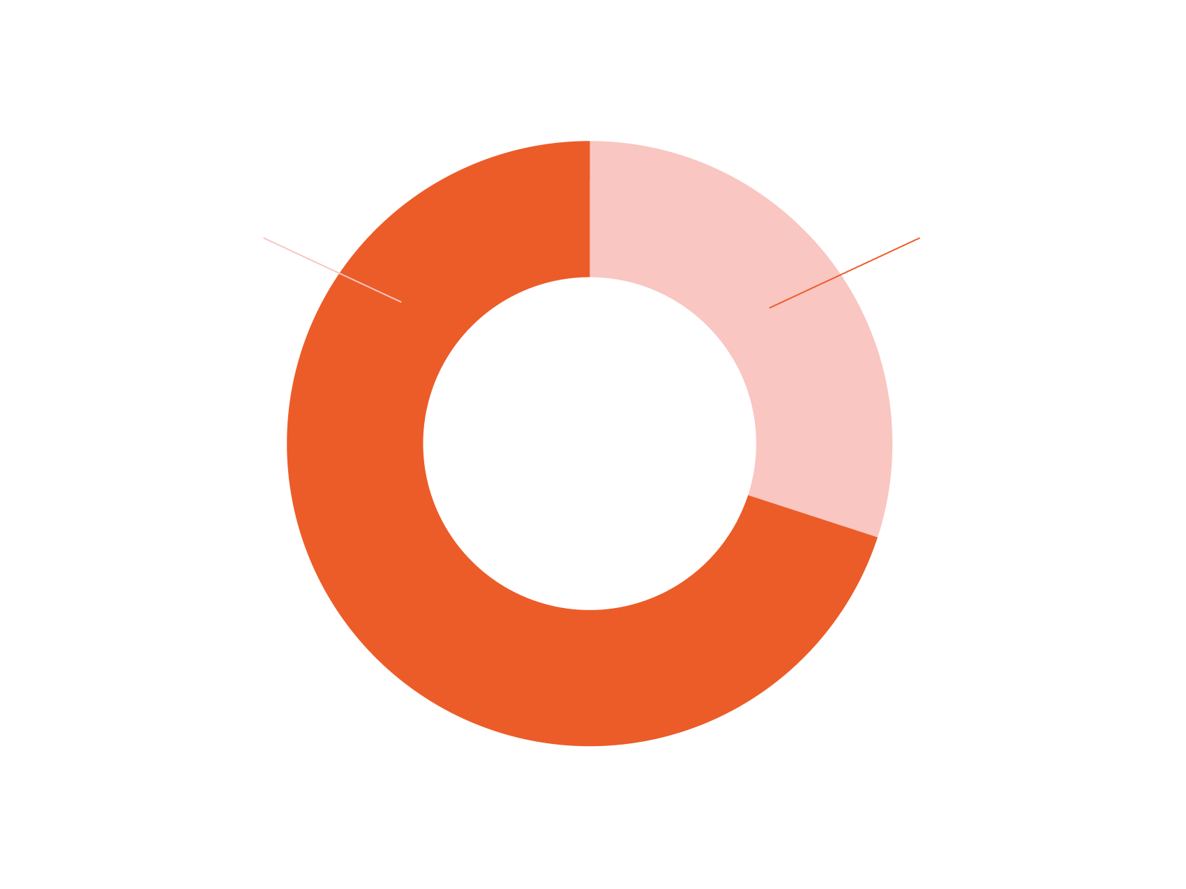
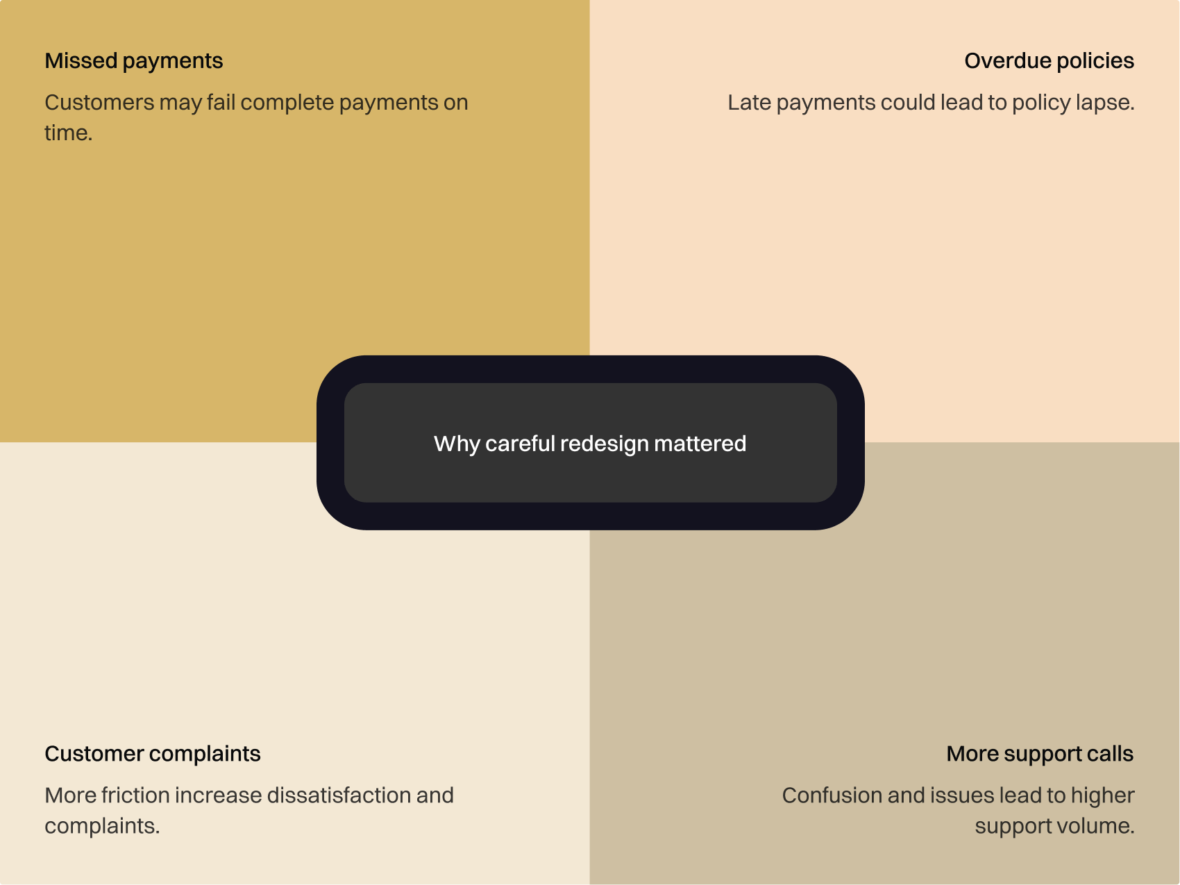
For many customers, payment was the main reason to use PRUServices. Stakeholders highlighted that policy payment represented around 70% of Malaysia transactions. If the redesign made the journey harder, the risk was not just poor usability, it could mean missed payments, overdue policies, complaints, or more support calls.
So the goal was not to reinvent the flow. It was to improve clarity without disrupting a behaviour customers already knew.
Focused flow
Made payment feel like a focused task
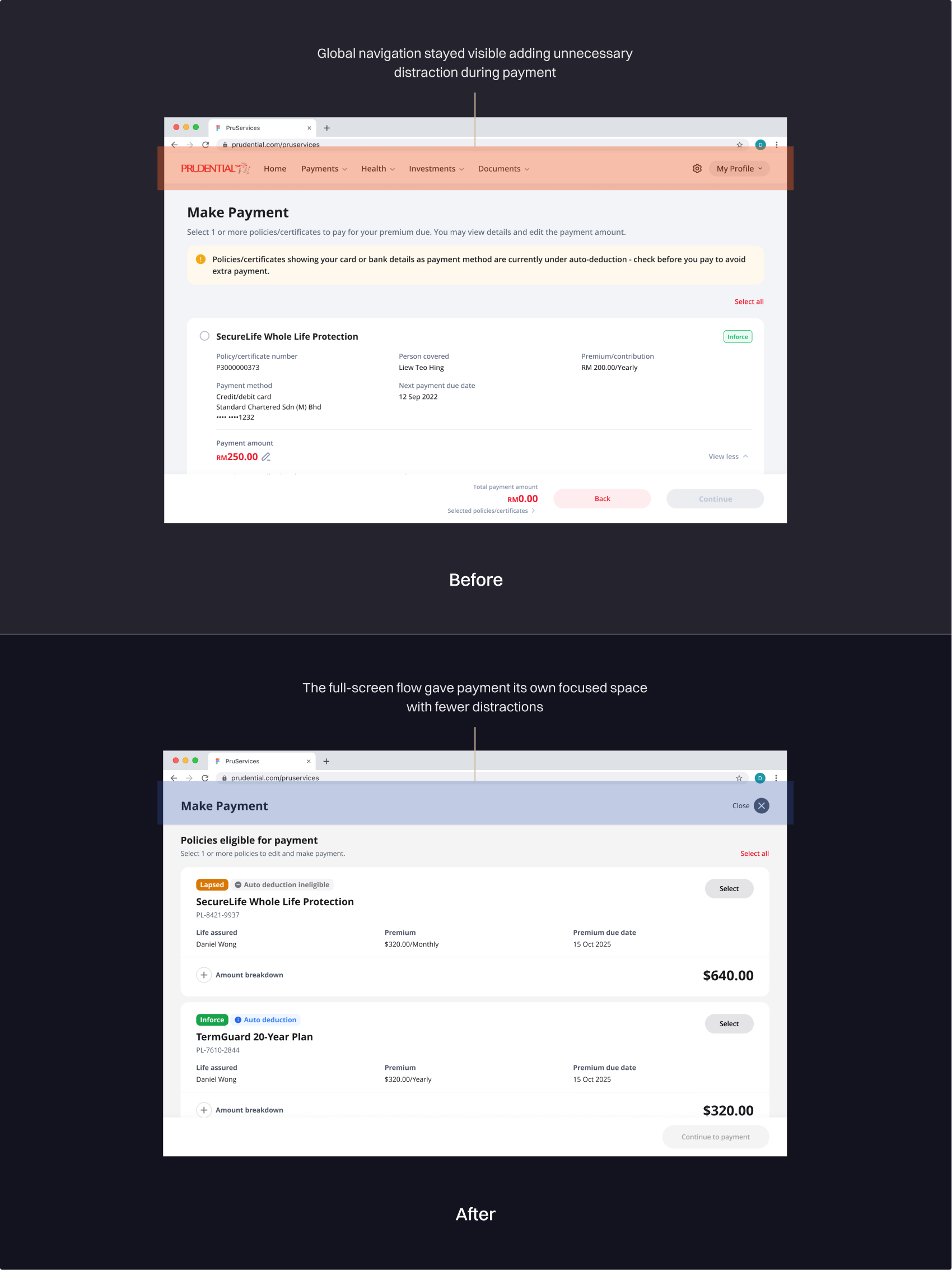
Previously, payment sat inside the main product page with global navigation still visible.
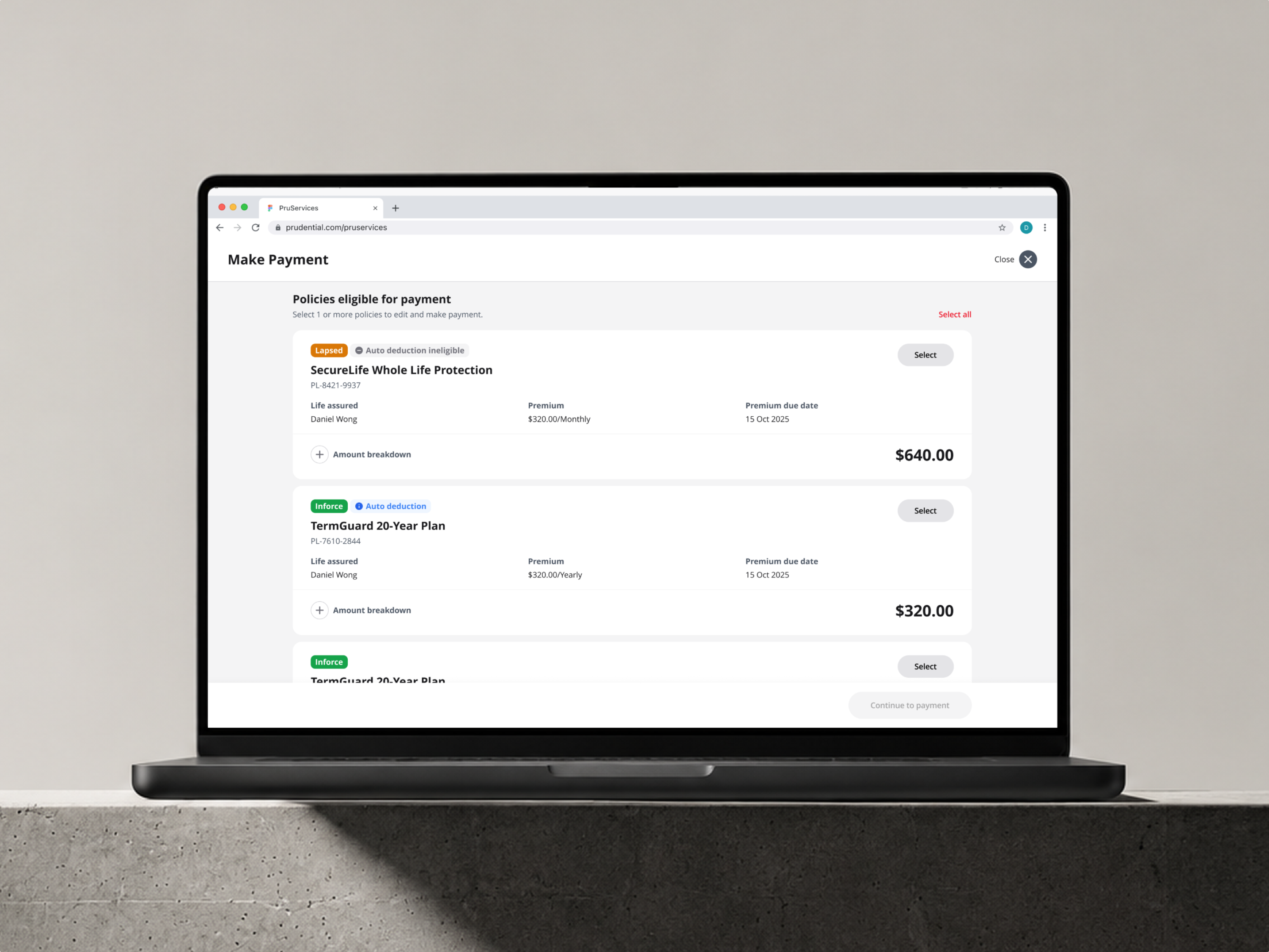
I moved it into a full-screen dialog pattern, following our design principle for multi-step journeys: keep customers focused, reduce distractions, and lower the chance of accidental context switching.
Clearer policy card
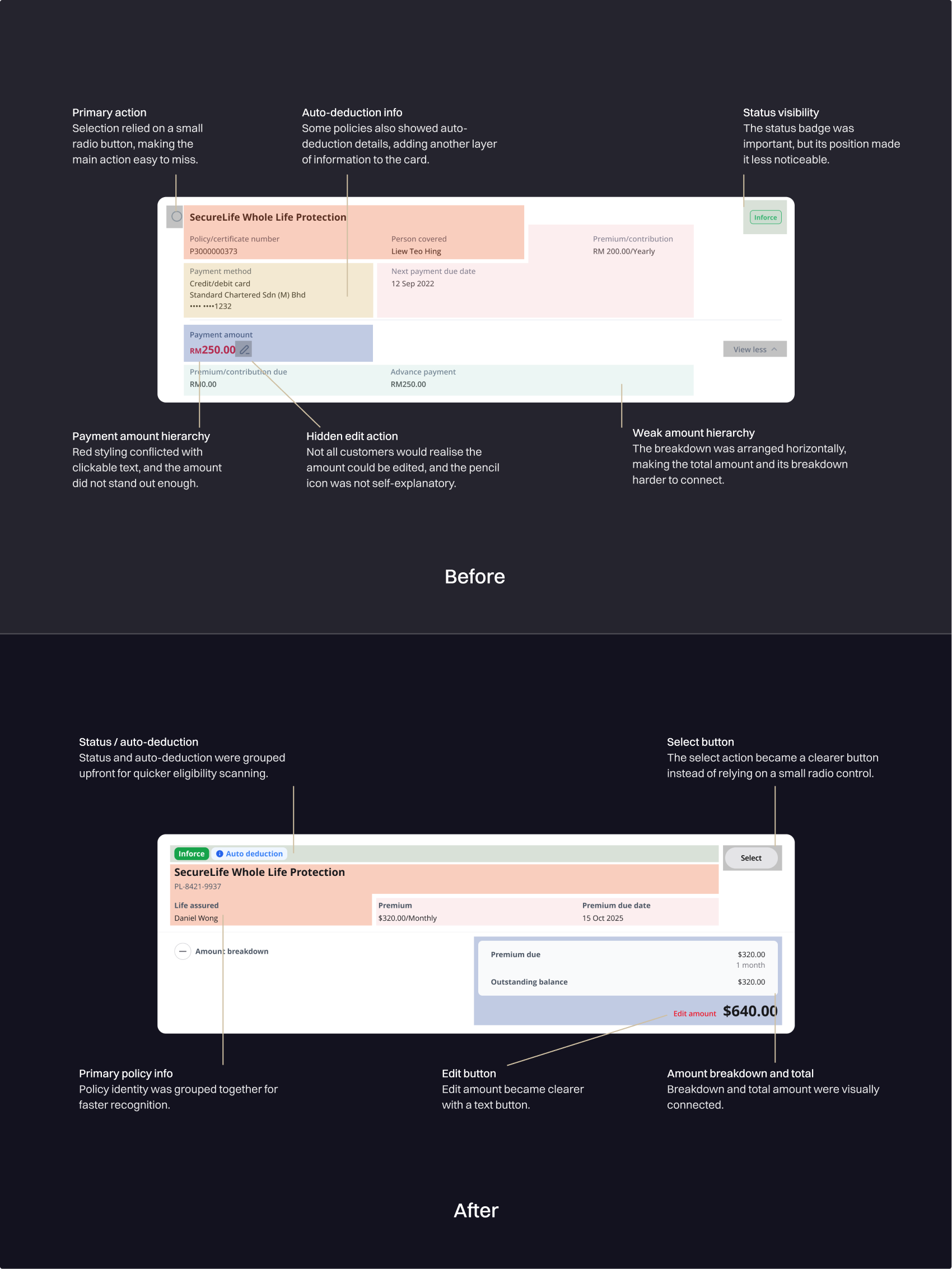
Redesigned the card around hierarchy
- grouping the policy name and policy number
- reducing the top section to key policy details
- moving the payable amount to a more prominent position
- changing the amount breakdown into a vertical invoice-like layout
- adding a clearer select button
The card became easier to scan without removing important payment details.
Lighter amount editing
Made amount editing feel lighter
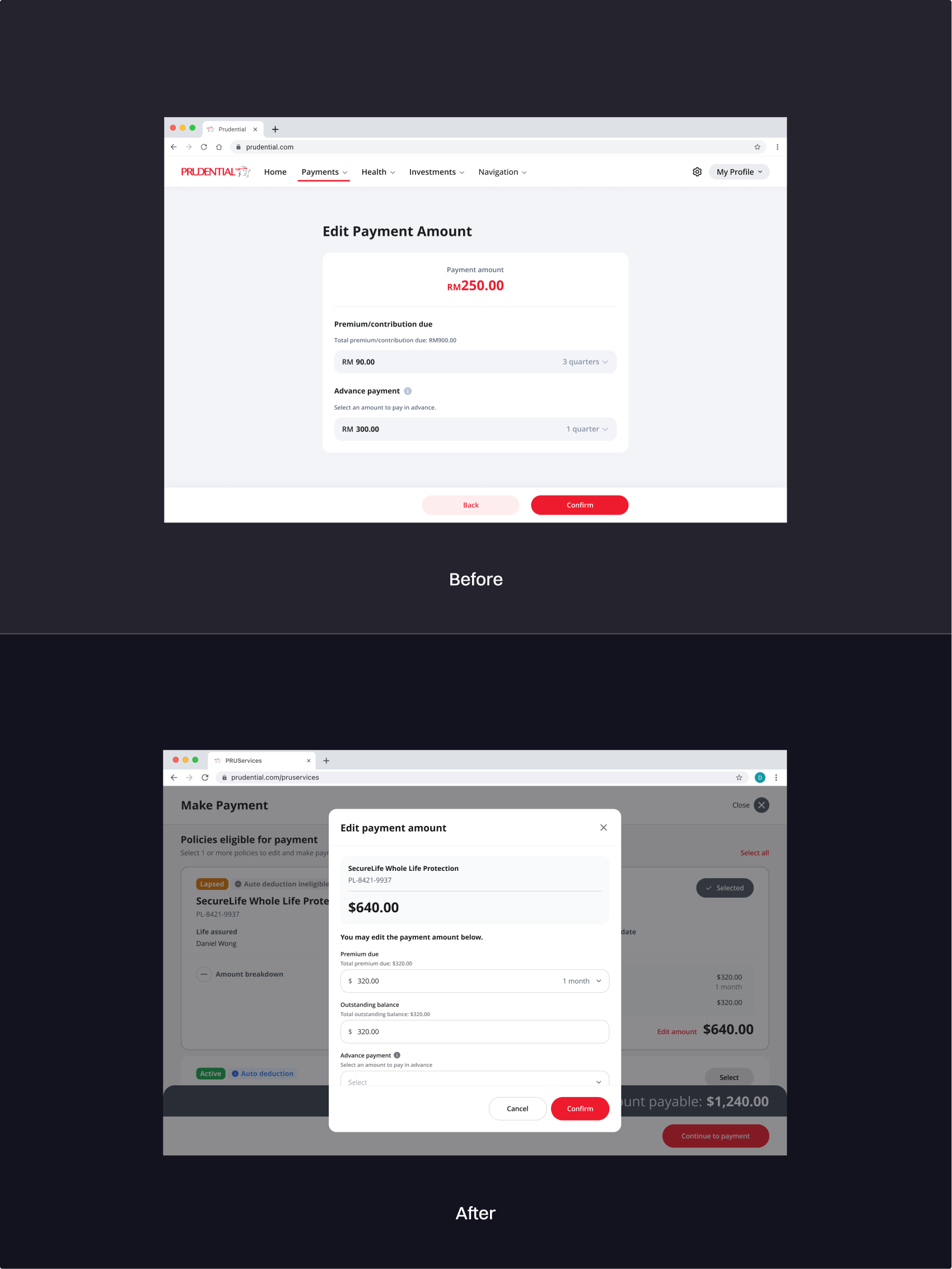
In v1, editing the payment amount opened a separate page.
For v2, I moved amount editing into a modal. This kept users in context while still supporting customers who needed to adjust the payment amount. It improved a low-usage but complex action without changing the main payment journey.
Responsive design
Final design across desktop and mobile
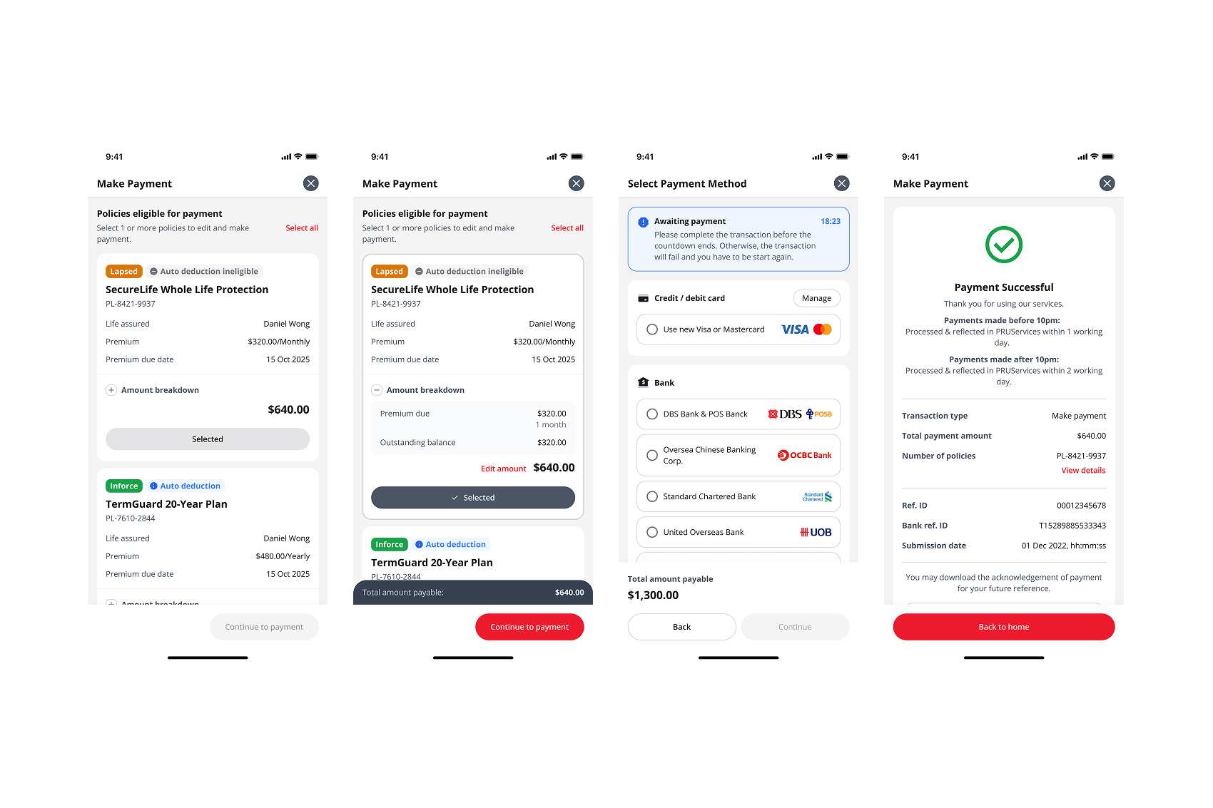
The payment flow was designed for both desktop and mobile. On mobile, the experience became a focused step-by-step journey, covering policy selection, payment method selection, and confirmation.
Reflection
What I would improve today
Looking back, I would define success signals earlier. Beyond redesigning the flow, I would track practical indicators from real usage: payment completion, modal usage, drop-off by step, error recovery, and support questions related to amount editing.
This project taught me that payment UX is not only about reducing steps. In a live, high-volume journey, the safer improvement is often making existing decisions clearer while protecting behaviours customers already trust.